

A look back
When we started Patch in 2020, our goal was to be the catalyst in scaling climate action. We started by building the infrastructure needed to connect companies with the crucial climate projects drawing down carbon dioxide. We envisioned a world where taking action to address climate change could be a part of every company and every person’s daily life.
Since then, we’ve brought on some of the most innovative and renowned climate projects to our platform. We’ve worked with hundreds of companies to help them and their customers take climate action. And we’re lucky enough to have done this all with an exceptional, nimble team. (we’re hiring!)
As we’ve gained momentum, we knew it was time to refresh our identity to better reflect what we’re working on now and what’s coming in the next phase of our company.
A brand is more than just its visual identity or look and feel, it’s also the words that we use to describe who we are and what we stand for. We took the time to refine and recalibrate these too.
Introducing our new brand
Patch is at the intersection of climate science and modern technology. We believe our new brand better personifies who we are today, and the future of where we’re going.
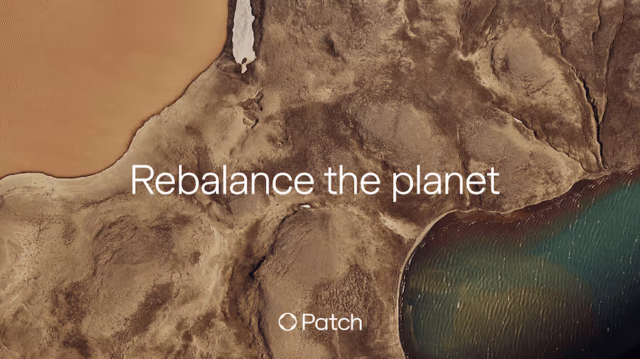
We’ve set out to rebalance the planet.
Our vision is to make a livable future inevitable.
Our mission is to advance technology that makes meaningful climate action a part of everyone’s business.
And, we’re scaling unified climate action to make it happen.
Today, we’re unveiling a new visual identity, complete with a fresh new logo, color palette, typography, illustrations, and photography.
New logo and mark
Our symbol is comprised of two base forms – the Patch and the circle. The Patch represents our growing network of partners and projects, while the circle shows the Earth rebalanced. Combined together, the symbol represents the synchronous relationship between the two.

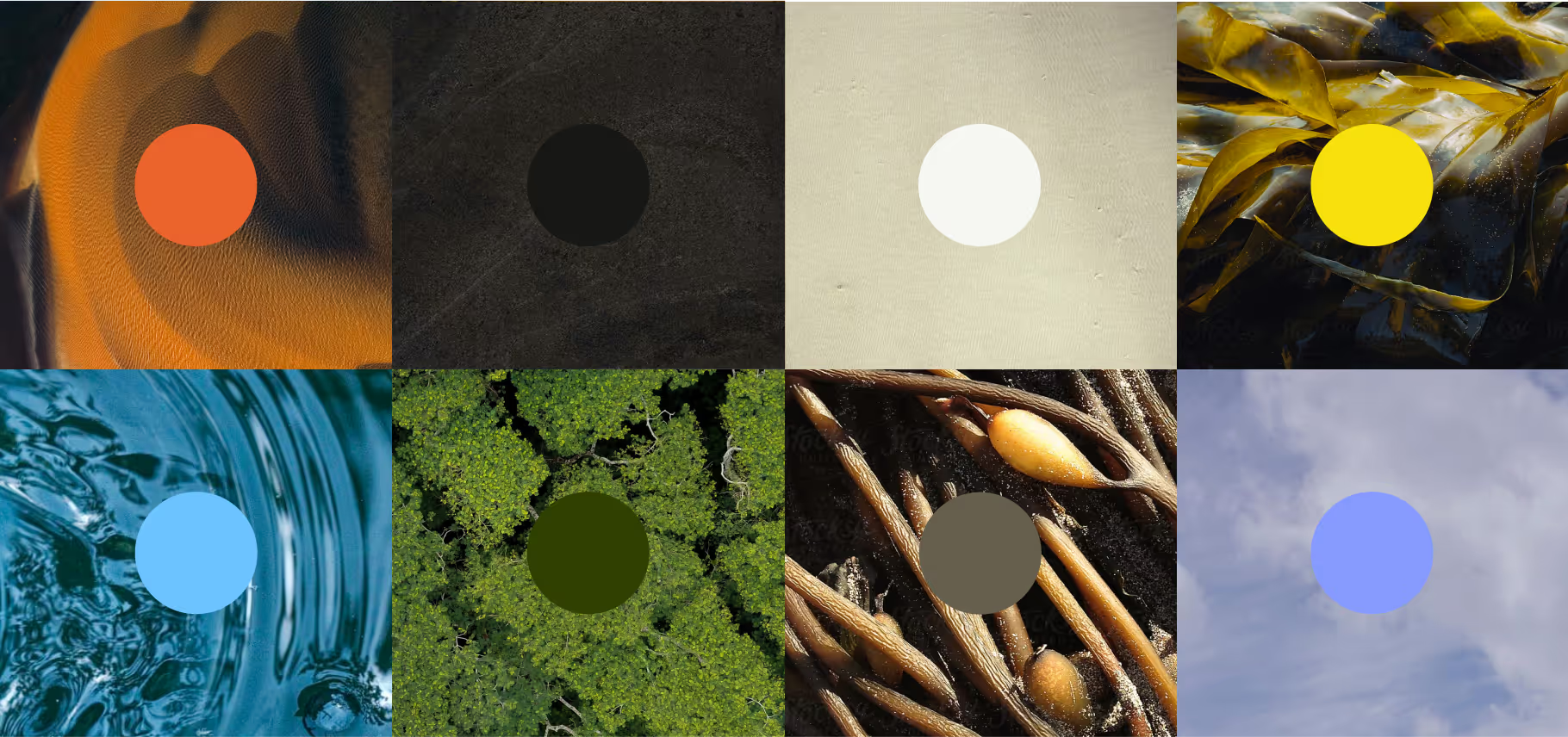
New color palette
Drawing inspiration from snapshots of Earth, our color palette pulls a mixture of light, deep and rich tones that move us to make a regenerative world a reality.
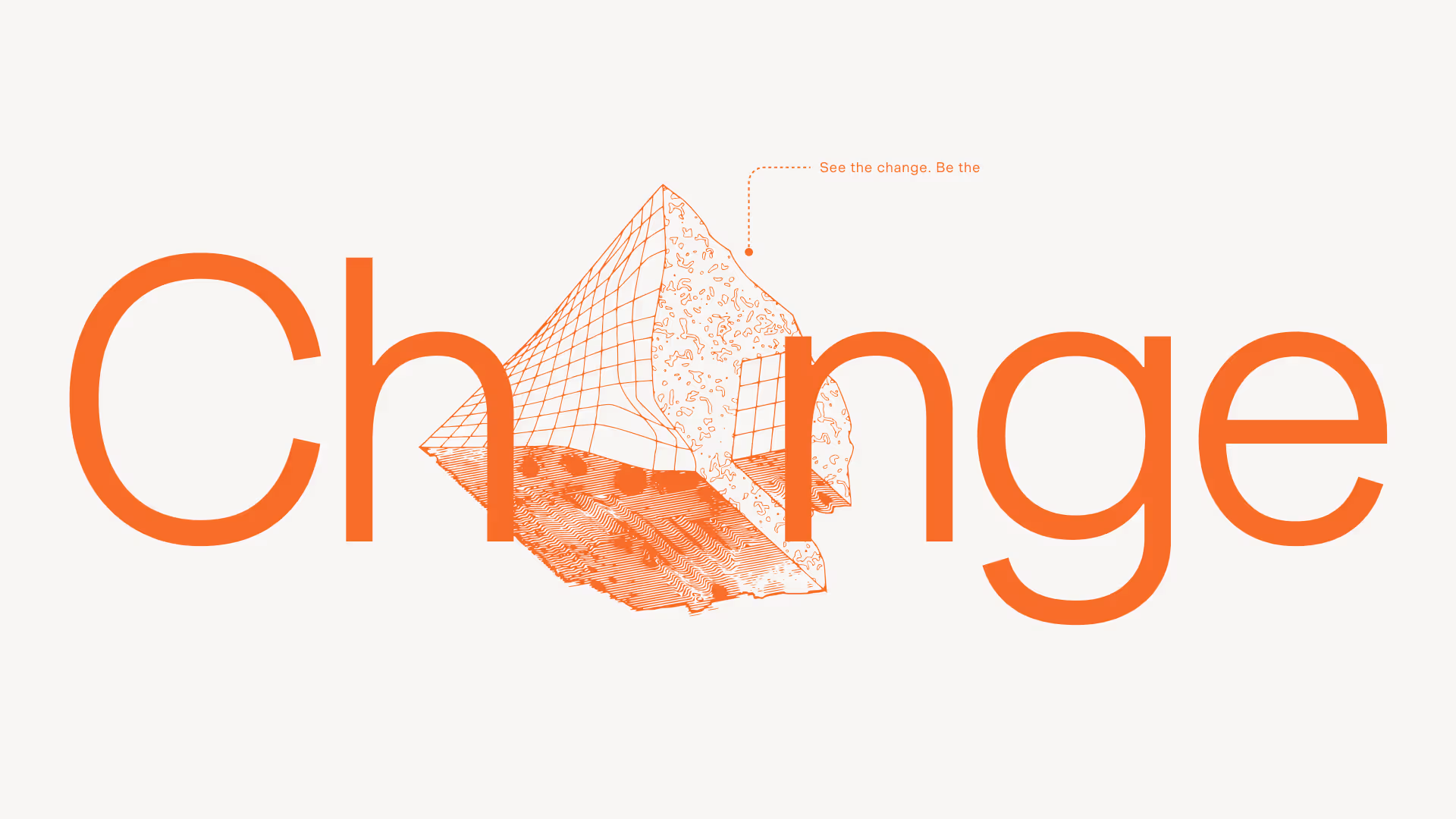
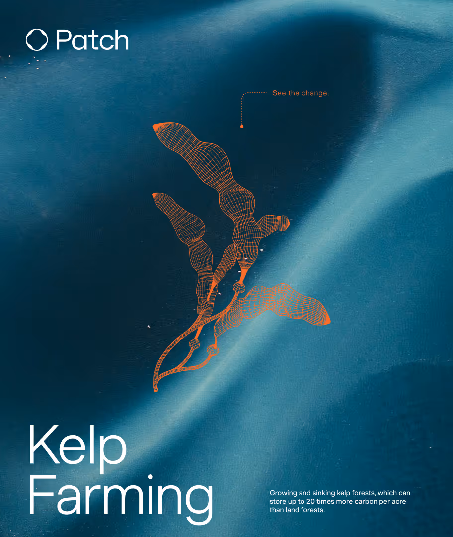
New illustrations
Every day, we think about how we can better elevate, support and spotlight the climate projects we work with, and the incredible creators behind them working to rebalance the planet. We wanted to bring these inspiring projects out from behind the scenes and into the forefront. That’s why we also created a new visual language to better represent the essential climate projects that are the core backbone of everything we do.
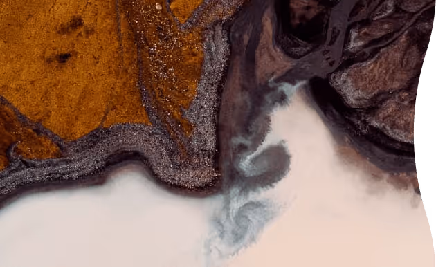
New photography
We are also extremely excited to be partnering with the very talented artist, Tom Hegen, on his incredible bespoke photography as the backdrop for our new brand. Tom’s aerial photography beautifully showcases the Earth we are working to protect each day.
Shoutouts
We couldn’t have done all of this without an incredible partner. We were lucky enough to work with the award-winning design agency, Koto. Across the company, we tapped into so many insightful people to help carry us to the finish line.
A foundation for the future
One of the core cultural principles of our company is that we build the future we want. With the new brand identity unveiled today, we’re energized by the strong foundation we’re establishing now, that will take us into the future. Buckle up, it’s going to be an exciting ride.